Senior Product UX/UI Designer
Star separator
Senior Product UX/UI Designer
Star separator
Senior Product UX/UI Designer
Star separator
Senior Product UX/UI Designer
Star separator
Senior Product UX/UI Designer
Star separator
Senior Product UX/UI Designer
Star separator
Senior Product UX/UI Designer
Star separator
Senior Product UX/UI Designer
Star separator
Senior Product UX/UI Designer
Star separator
Senior Product UX/UI Designer
Star separator
Senior Product UX/UI Designer
Star separator
Senior Product UX/UI Designer
Star separator
Senior Product UX/UI Designer
Star separator
Senior Product UX/UI Designer
Star separator
Senior Product UX/UI Designer
Star separator
Senior Product UX/UI Designer
Star separator
Back arrow
Coming soon...

Rise+Shine

MVP mobile prototype

2021
Mobile
UI
UX
Wireframes
iOS
Interactive animations
Rise+Shine Logo

An iOS app to challenge GenZ to stop just watching and start engaging with some of the most interesting individuals, organizations, and companies in the world.

Weebox App
OVERVIEW
YEAR
  • 2021
TEAM
  • 1 Product/Project Manager
  • 1 Product Designer Lead (Myself)
ROLE
  • Ideation, Strategy, Information Architecture, Wireframes, UX/UI Design, Design System
TIMELINE
  • 3 Months

Before -> After

Weebox App before and after

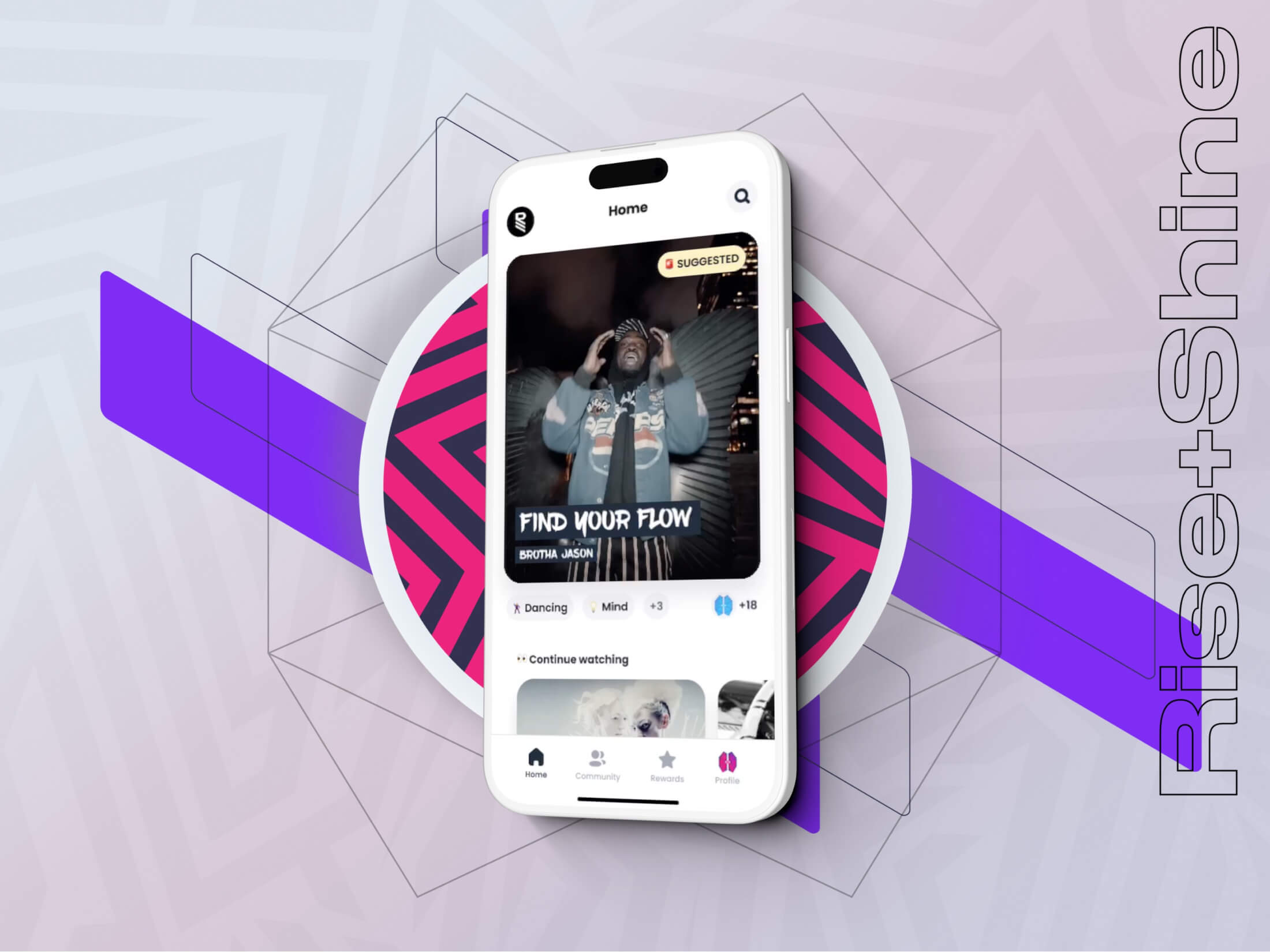
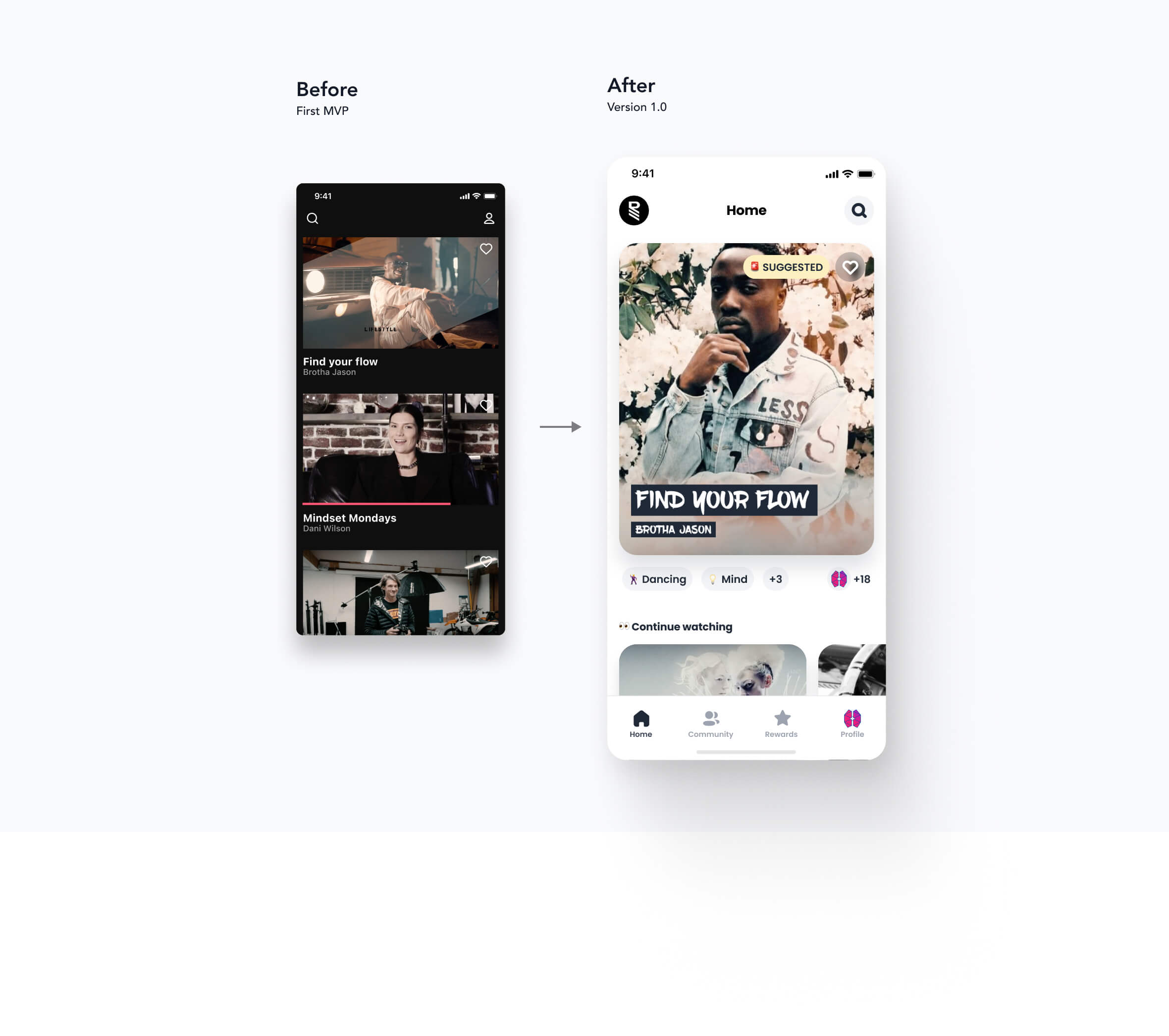
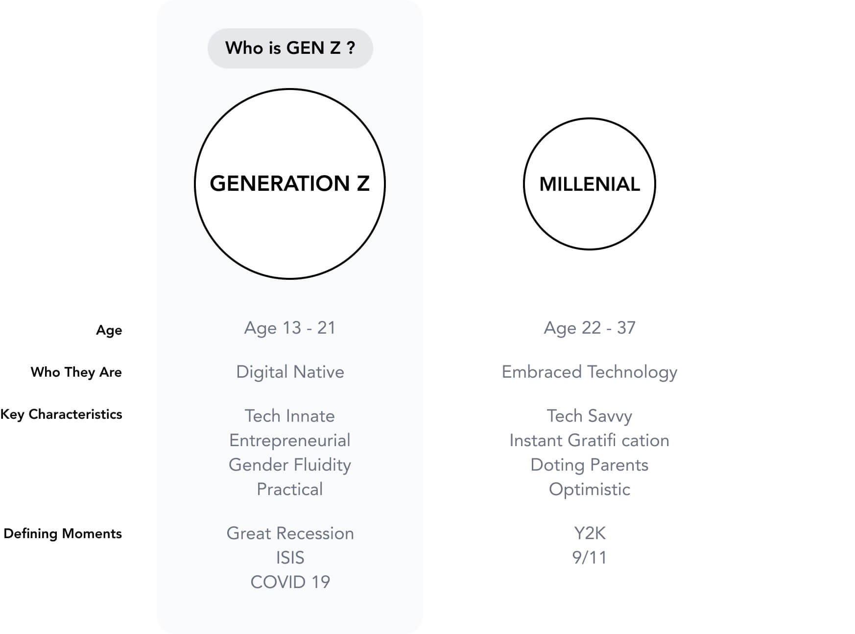
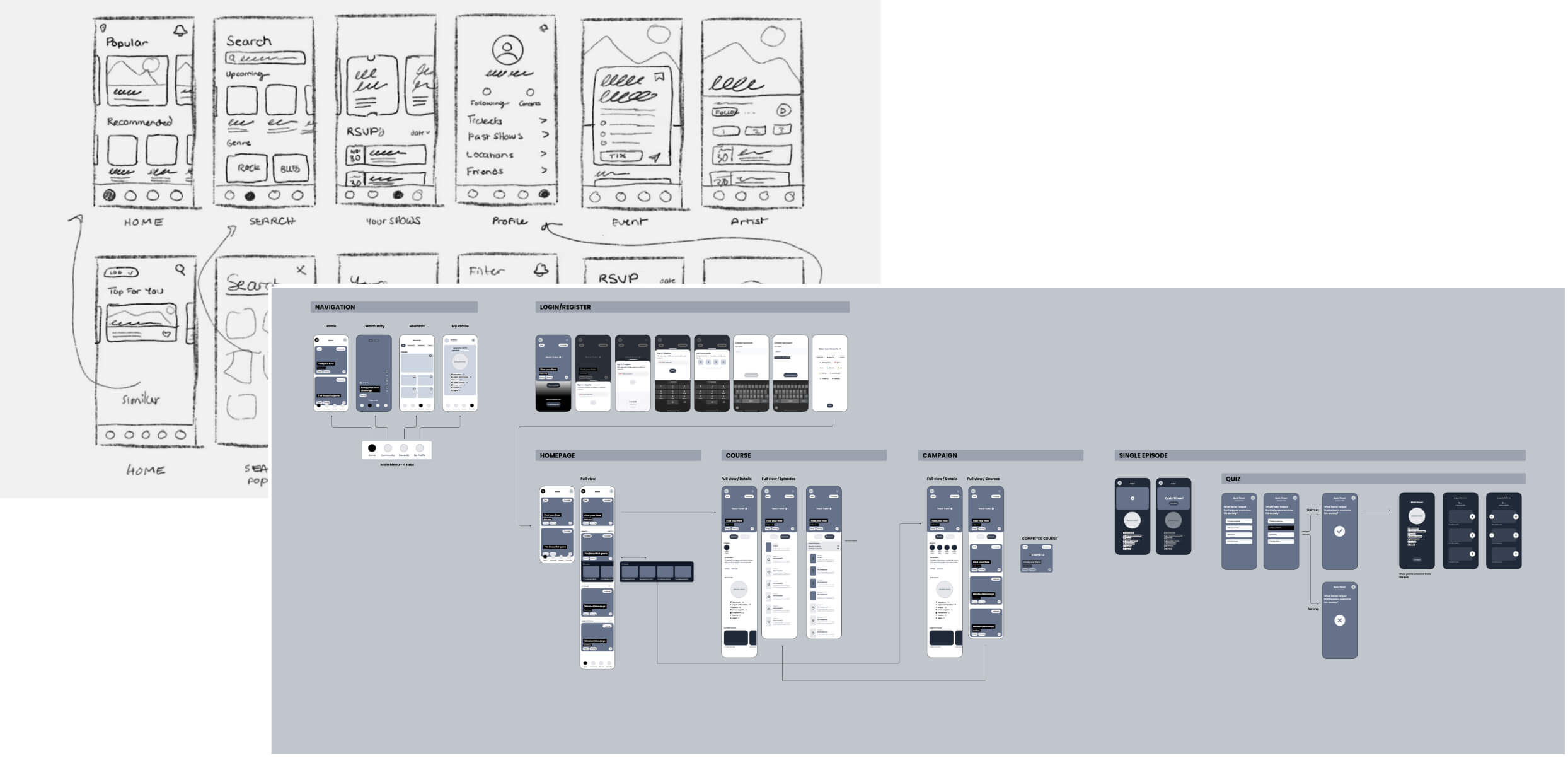
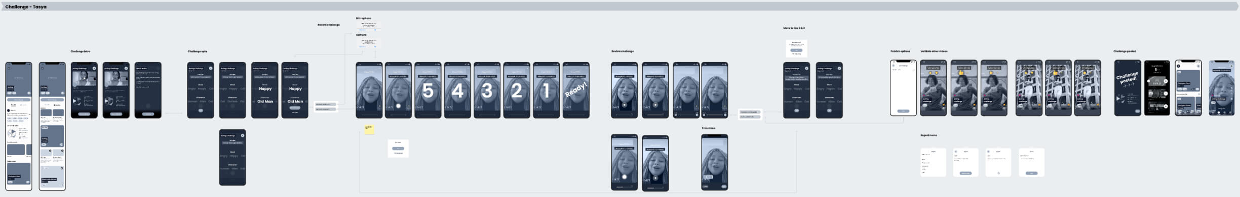
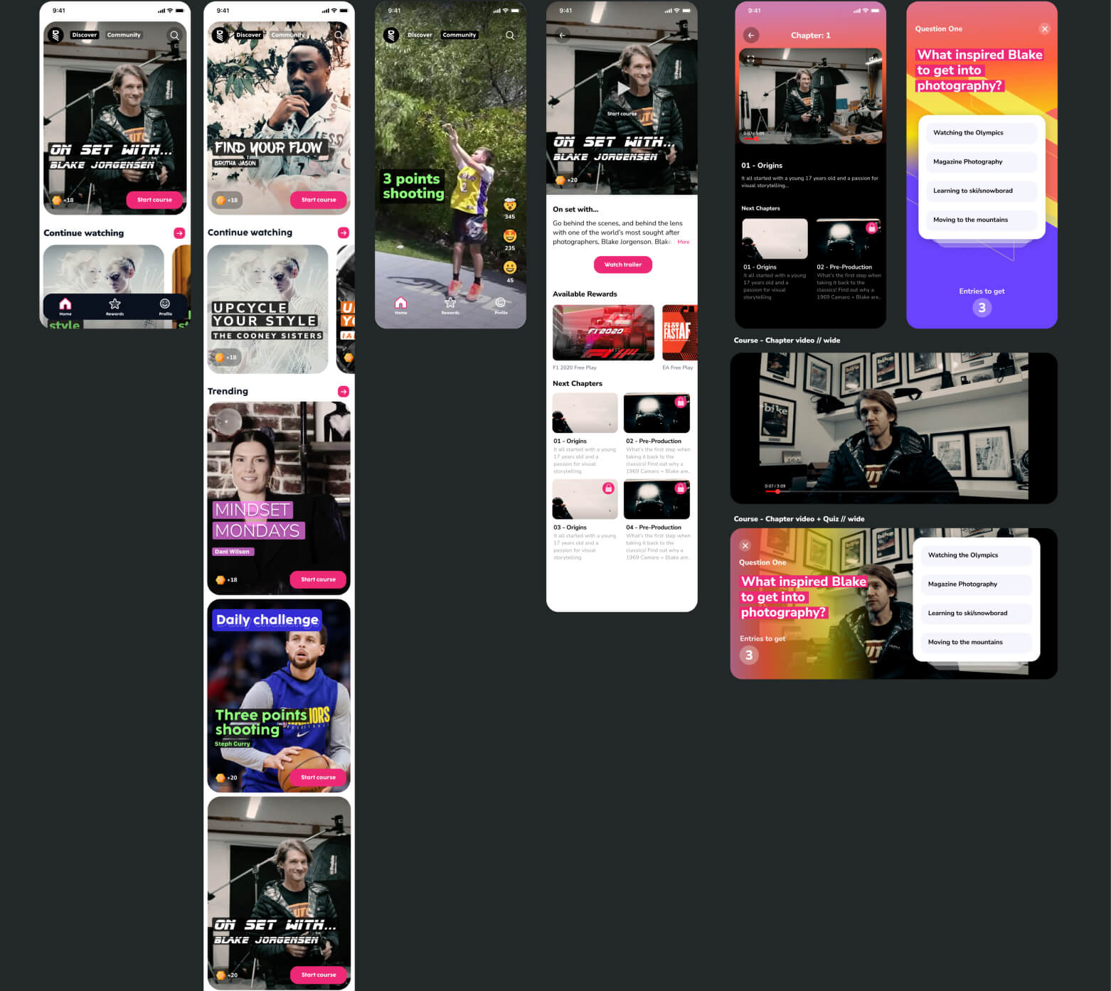
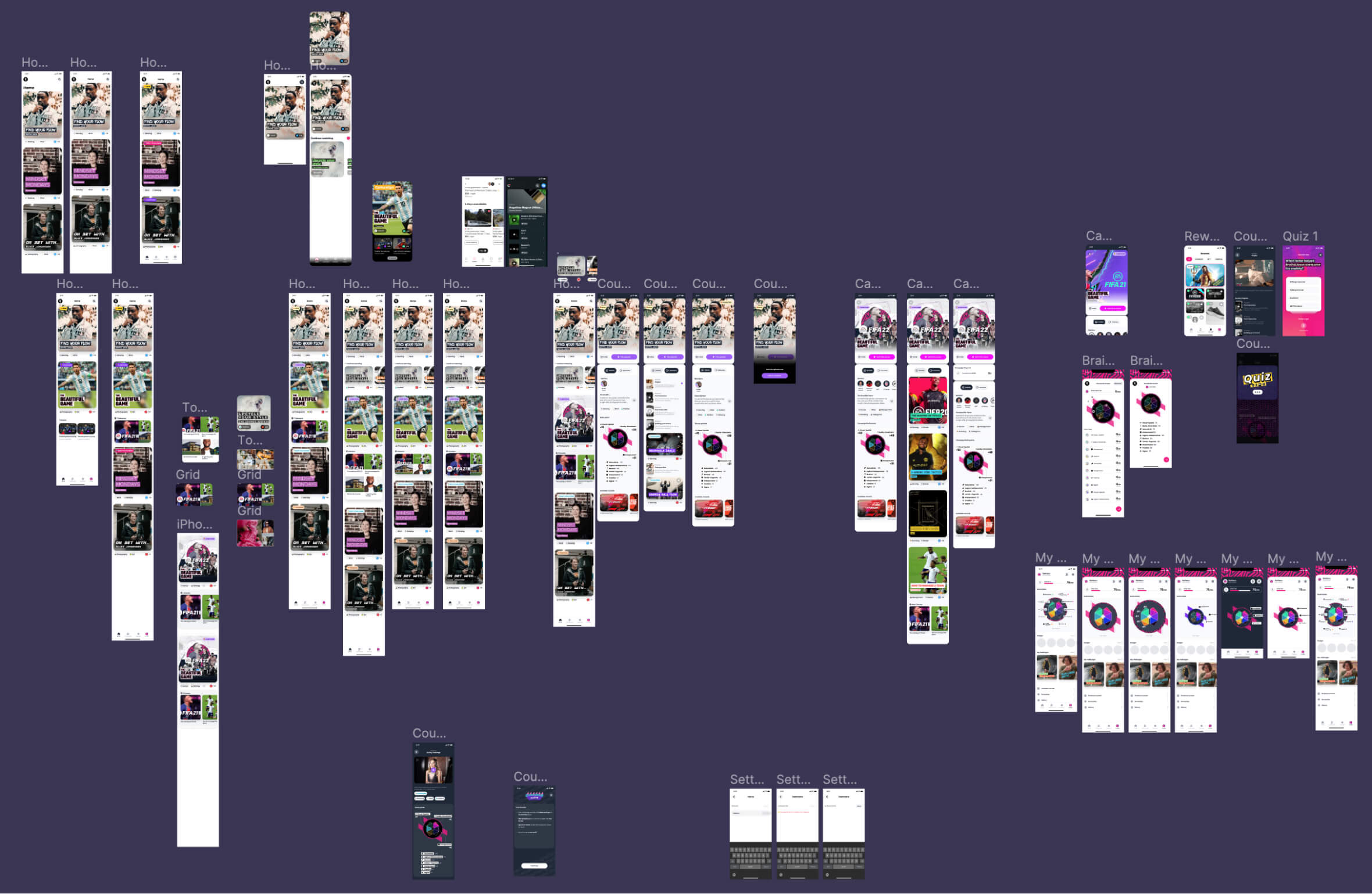
How can we build an engaging and appealing app for Gen Z?

Generation Z — the group of people born after 1996 and before 2013 — are youthful, adventurous, business-minded and cause-driven.

Gen Zs are growing up and coming of age in a time of heightened stress and anxiety. From violence and terrorism to a global pandemic, Zoomers have dealt with significant issues in a relatively short period of time.

Members of Generation Z report higher rates of depression and a number of other mental health conditions than do generations before them. At the same time, they are more likely than previous generations to report these problems, positioning those who seek help in a place to receive it.

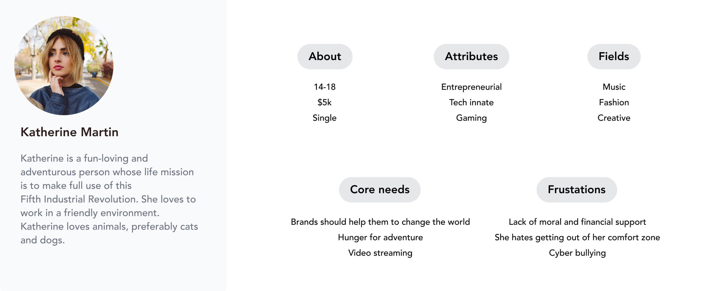
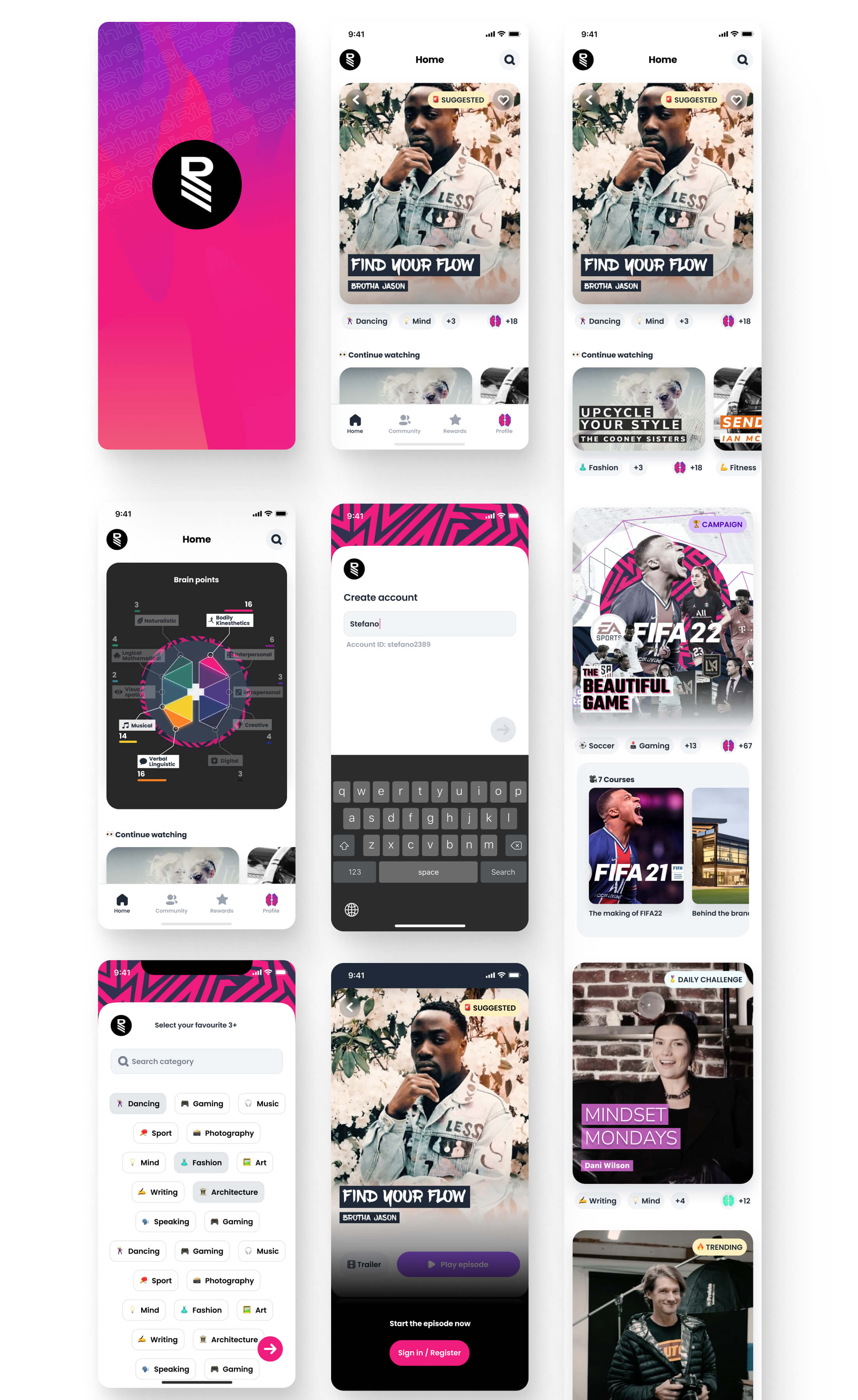
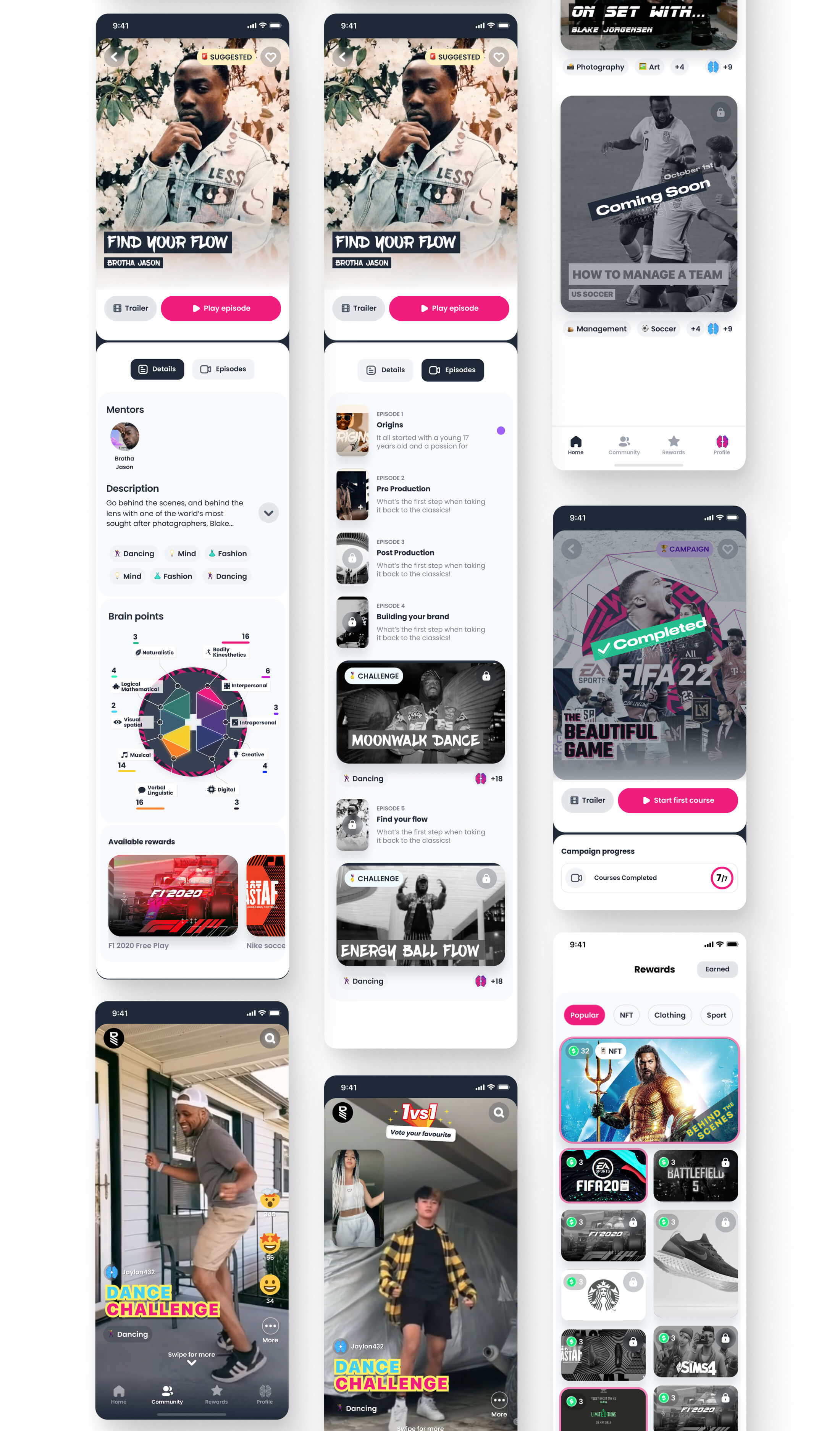
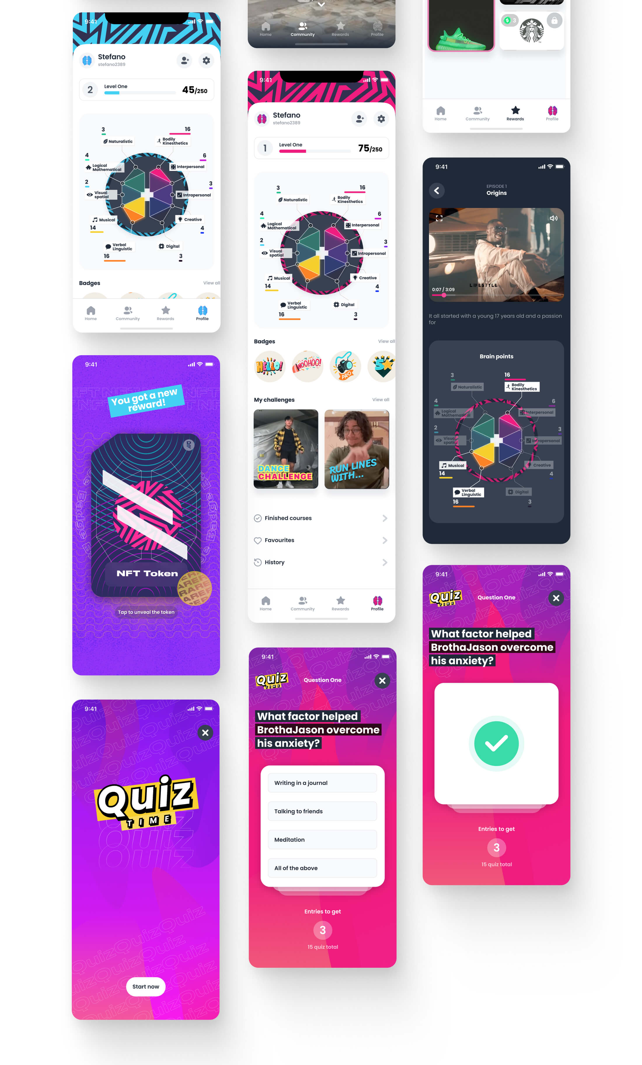
Rise+Shine mission is to Empower Gen Zs with the best balance of education and entertainment.

Build a product not about consuming but that challenge, engage and aspire.

More than just consuming content, we want to provide a trusted brand that forces Gen Z to take constructive and healthy challenges that help them grow and connect with friends!

  • Design and build a MVP iOS app as a proof of concept
  • Create a strong and trustworthy brand
  • Use a FOIL (Forms of Intelligence Learning) Algorithm contextualizes skill development to shape holistic skill sets and to promote improved mental health practices

Double diamond design framwork

Double Diamond design process

Discover

The team already spent many months doing surveys and research about Gen Zs. My main task at this step was to revisit the user persona. I started with a global overview of Gen Z.

Who is Gen Z

After this extended analysis, we had a clear idea about what type of users are using every day the product. This is what I identified:

Persona Gen Z

In order to gain a comprehensive understanding of the competitive landscape, I conducted a thorough analysis of R+S's primary competitors. This analysis focused on reviewing their global navigation, homepage content and hierarchy. By examining the competition, I could identify industry best practices and potential areas for innovation.

Competitive analysis
Process step

Define

At the end of the discovery phase, I wanted to Involve the team members in creating principles to follow closely for the new design.

Here are the final principles:

  • Prioritize a Smooth User Experience — Build your app with swift and straightforward interactions and don’t reinvent the wheel for every feature within your product—draw inspiration from apps that are already working.
  • Make It Visual — Younger audiences aren’t interested in sifting through different kinds of content. Video content is more straightforward for them to navigate, and they tend to absorb it quicker than reading.
  • When creating a video for Gen Z, there are a few essential must-haves:
    • Creative, short-form video is the way to get Gen Z to love your brand—but attention spans are short. Use catchy, hyper-relevant content to grab the user’s attention within the first 3 seconds or risk losing it altogether.
    • Use content that can be consumed with the sound-off by employing captions and visual storytelling. This is a recommendation for all users, although it is also best practice in regard to accessibility. Reconsider the use of any content where sound is a must.
  • Help To Express Authenticity & Individuality — Gen Zers are conscious of their “personal brand”—the aesthetic representing their personality and interests.

I made the App Information Architecture, the app is structured by campaigns and courses that contain multiple lessons, at the end of every lesson user receive points to join raffles and to increase their brain level areas. A big part of the app I suggested was adding a “social” part into it, this will help users create and consume content and create a sense of connectivity will other Gen Zs using the app. So with the team, we wanted to add a Challenge section.

Information architecture

I also made a relationship logic map to consolidate the app system and to see how every feature is connected together.

Relationship logic map
Process step design

Design

Utilizing the insights gathered from my research, I developed initial flows and low-fidelity mock-ups. These mock-ups incorporated all the above-mentioned principles. After I presented my designs to the product team for feedback and incorporated their insights we voted the best screen approaches. Subsequently, I presented the mock-ups to the project stakeholders for review and approval.

Lo-fi mockups

During the design process I focused on creating multiple prototypes to validate some of my flows, I made those in Figma and I shared them inside the company and I also took video recording for facilitating the feedbacks process.

Login/Register flow

Below is a recorded flow about the Login/Register flow. In this case, we wanted to use the SMS validation method to make the experience smoother instead of asking for the usual email registration approach.

Course challenge

Here is another example of the exploration of challenges inside a course.

Challenge flow

After a good number of iterations with the team we decided on the best flow and I started to move to high-fidelity mock-ups.

Hi-fi version oneHi-fi version twoHi-fi version three

Homepage

The homepage has been designed keeping in mind the aesthetics that appeal to the Gen Z audience. The page is easy to browse and displays the most important information upfront. We have followed one of our core principles and have included short video clips for every Lesson/Campaign.

App Homepage

My profile

The user profile is a very important entity inside the app, since every user belongs to one of the ten brain levels, we gave big importance to the levels. The level is the entity that excites, engages and delights the user. For this reason, every level is unique and this peculiarity was reflected via design by providing customized visual assets depending on the current user level like:

  • Customized brain-level colour icon
  • Customized app icon launch colour
  • Customized splash screen on launch
App level profileiOS App iconsLevels overview
Star icon

The Product
Bringing it all to Life

App overviewApp overviewApp overview
Process step deliver

Deliver

Design system

After the main UI was finalized I organized all the elements and created the R+S design system in Figma called Rise. By creating Rise I took the opportunity to consolidate all the UI elements and fix some small imperfections present in the app.Everything was made as a symbol and component and clearly organized!

Rise coverRise screenshot
Rise overview

Prototype / Usability testing

We tested the flows internally with the team, we decided to don’t make usability testing with external people, since we preferred to create a beta closed release for a small group of users. During the testing phase, I was able to gather further ideas and some good insights.

Prototype

Outcome, great potential

Despite the great internal feedback about the whole product, “We’re going to win a design award with this app!” the company wasn’t able to find a round of investors and a developer team and consequentially there was no space to add a developer team to build the product. Working in an early-stage startup has given me a unique opportunity and extensive hands-on experience in product design and management processes in an environment dictated by business objectives, tight schedules, and financial limitations.

Insights

This was an incredible experience for me! I wanted to focus on native mobile apps because I wanted to challenge myself and have the opportunity to improve my skills, the outcome was outstanding and I’m proud of what the team built. Creating an app for Gen Zs was a unique chance and helped me to learn about the new generation that is coming!